You open a Meta account and two audiences both show a $70 CPA.
The obvious audit is simple: pause the expensive rows, scale the cheap rows, and write "improve creative" next to everything else.
That feels disciplined because CPA is the number everyone cares about. It is also how a lot of account reviews become surface-level. The same CPA can be caused by completely different mechanics.
One $70 CPA can come from expensive clicks and a strong funnel. Another $70 CPA can come from cheap clicks and a broken product-page handoff. A third can be fine if it buys higher-AOV customers and terrible if it buys low-margin discount buyers.
The table calls all of them "bad CPA." The account needs three different decisions.
The sharper question is not "is this segment good?"
The sharper question is:
That question turns a Meta report from a scorecard into a constraint map.
CPA is the output, not the diagnosis #
CPA is useful. It is just too compressed to be the first read.
At the simplest level:
If CPA is too high, the segment has to move in one of two directions:
But that is only the first layer. A real ecommerce account has at least five constraints:
This is why "bad CPA" is not enough. It does not say which constraint is binding.
The anti-example is the account review where every under-target row gets called a winner and every over-target row gets called a loser. That review can kill premium demand, overfund cheap low-value buyers, and waste weeks trying to fix a funnel that is actually paying too much to enter the wrong market.
Build the map before reading the rows #
Use a fictional ecommerce brand so the math is inspectable.
The exact brand is fake. The numbers are designed to reconcile. That matters because a fake dataset should not teach fake math.
Here is the raw segment data:
The derived metrics follow directly:
If you only read the CPA column, you can make decent guesses. But you cannot see the mechanism fast enough.
You need the map.
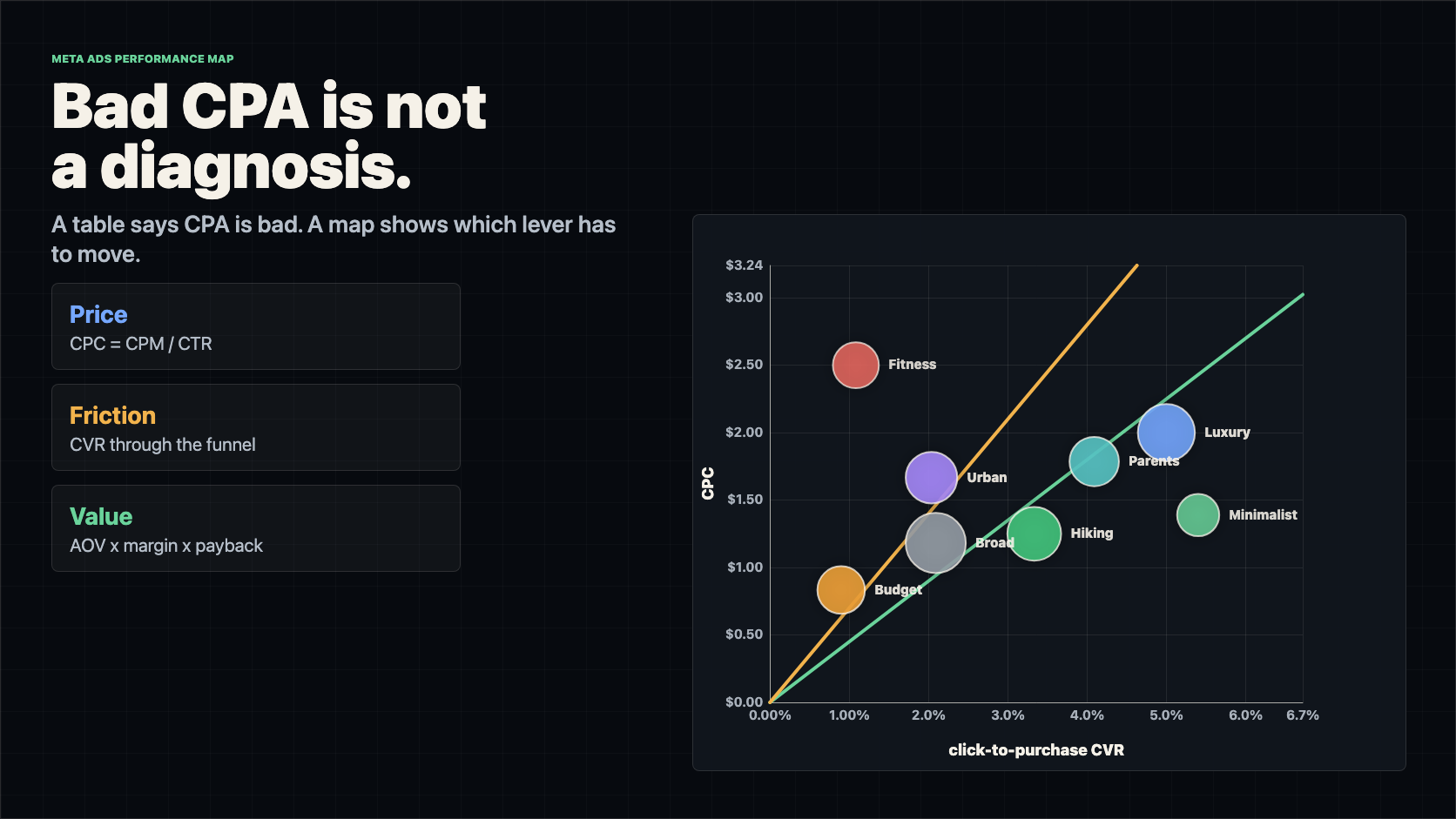
The first chart is CPC vs CVR #
For the core view:
The target line is not magic. It is the CPA formula rearranged:
At a $45 target CPA:
That one line destroys a lazy belief: expensive clicks are not automatically bad. They are bad when conversion and value cannot carry them.
Luxury Travelers pays a $2.00 CPC. If you sort by CPC, it looks expensive. But it converts at 5.0%, produces a $40 CPA, and has the highest AOV in the sample. The account should not treat it like a generic cost problem. It should ask how to find more demand that looks like this without bidding itself into a corner.
Budget Gear Shoppers pays only $0.83 per click. If you sort by CPC, it looks attractive. But it converts at 0.90%, produces a $92.86 CPA, and buys lower-AOV orders. Cheap attention is not the same as profitable attention.
That brings us back to the original mistake. The CPA column did not tell us what was wrong. The map shows the direction each segment has to move.
Quadrants are a start, not a strategy #
The first read is still useful:
The anti-example is worshipping the quadrants.
Quadrants are descriptive. They do not know your target CPA, gross margin, payback window, sample size, or the segment's job in the account. A segment can be in the expensive-click quadrant and be excellent. A segment can be in the cheap-click quadrant and be a trap.
The better sequence is:
- quadrant read
- economic line
- required movement
- funnel location
- value capacity
- confidence
- decision
That sequence is what turns the visual into an operating tool.
Required movement is the real decision #
Once a bubble is above the target line, calculate both ways it could get back under target:
Then compare the required move with reality.
Budget Gear Shoppers looks bad in a CPA table:
That is a serious lift, but it is not automatically impossible. The auction is giving the brand cheap clicks. The question is whether the landing page, product promise, offer, or retargeting path can turn more of those clicks into buyers.
Fitness Lifestyle is different:
That is not a normal optimization ask. It needs roughly a 5.1x CVR lift or an 80% CPC reduction. In a first-pass audit, this goes to kill, cap, or full rebuild.
This is the useful difference between "bad" and "unrealistic."
Those thresholds are not laws. They are a forcing function. The audit should say how far the row is from working, not just whether it is above or below target.
Split price before blaming the audience #
If the bubble has to move down, "lower CPC" is still not an action.
CPC decomposes into auction price and attention efficiency:
That creates a second map: CPM vs CTR.
Luxury Travelers has a $50 CPM and 2.5% CTR. It pays a premium for the audience, but the creative is not being ignored. The better question is how to lower entry price without losing the premium demand signal.
Fitness Lifestyle has a $30 CPM and 1.2% CTR, then weak post-click conversion. That is not one clean price problem. It is weak attention and weak buying intent together.
This matters because the fix changes:
The common mistake is trying to solve every high-CPC row with new creative. Sometimes the creative is already doing its job and the market is simply expensive. Sometimes the market is fine and the creative is not earning its way in.
Split friction by funnel step #
If the bubble has to move right, "fix the funnel" is also too vague.
Walk the funnel:
- impression -> click
- click -> landing page view
- landing page view -> add to cart
- add to cart -> checkout
- checkout -> purchase
Each transition asks a different question:
Budget Gear Shoppers leaks before checkout:
The cheap traffic reaches the page. The page does not create enough product intent.
The anti-example is calling this an "audience problem" because CPA is bad. Maybe the audience is wrong. But the first visible constraint is product-page intent. A better test would make the budget buyer's value equation clearer: sharper price anchoring, starter bundle, comparison proof, durability argument, shipping clarity, or a landing page that matches the ad promise.
Urban Commuters is different. It has a higher CPC and a middling funnel. It may need both a cost reduction and a conversion lift. That is a different test plan than Budget Gear Shoppers.
Add value before you kill expensive rows #
CPA is cost. It is not value.
A $55 CPA can be excellent if the segment buys high-margin premium bundles. A $35 CPA can be weak if it buys discounted, low-margin, high-refund orders.
So add value capacity:
For Alpine Supply Co., assume $8 of variable non-COGS costs per order and a required $18 contribution after acquisition.
Now the target line has context.
The $45 target CPA is a portfolio operating target. It is useful as a first line on the chart. But it should not be the only line in your head. Some segments can rationally support more CPA because they produce better orders. Others need to be held below the blended target because the customers are worth less.
This is the trap in a lot of Meta accounts:
Broad Advantage+ is a good example. It has scale and a tolerable CPC, but its CPA is above the $45 target and above its estimated allowable CPA. The answer might not be "kill broad." It might be to improve value: product mix, bundle attach, upsell, landing-page merchandising, or exclusion rules that keep broad from overfeeding low-value buyers.
Confidence decides how hard you act #
Bubble size should not be decoration. It should encode evidence.
The anti-example is celebrating the prettiest CPA in the account when it came from three purchases and $180 of spend. That is not a winner. It is a sample.
Use spend, clicks, and purchase count as confidence gates:
This changes the action:
Minimalist Travelers has excellent metrics and 70 purchases, but only $1,800 of spend. It deserves more budget, but the right move is staged expansion, not blind scaling.
Fitness Lifestyle has bad economics and weak volume. You do not need to overfit the diagnosis. The next dollar is better spent elsewhere unless it is being kept as a deliberate creative or market learning test.
Pick metric pairs by question, not by habit #
The CPC vs CVR map is the center because it explains CPA. But a large Meta account needs a small library of metric-pair maps.
The rule:
Useful pairs:
The anti-example is building one mega-dashboard where every chart is visible and nothing is decisive. That is just the CPA table wearing a costume.
Choose the next chart from the problem:
- CPA bad and CPC high -> inspect CPM vs CTR
- CPA bad and CPC acceptable -> inspect funnel-step friction
- CTR high and CVR low -> inspect message match
- CVR high and CPC high -> inspect cheaper supply and value capacity
- CPA acceptable but profit weak -> inspect AOV, margin, refund rate, LTV
- CPA great but spend tiny -> inspect confidence and volume ceiling
Meta reporting makes it easy to customize reports, breakdowns, metrics, and filters. Meta's docs describe Ads Reporting, breakdowns, and metrics such as CPM, CPC, CTR, and frequency. That flexibility is useful, but the metrics are ingredients. The diagnosis comes from pairing them around a decision.
Filter before comparing #
The fastest way to make a smart chart stupid is to mix unlike markets.
Do not compare prospecting and retargeting as if they are one market. Do not compare purchase campaigns to lead campaigns as if their outcomes are equivalent. Do not compare a 3-day-old creative to a 45-day-old creative without labeling age. Do not mix checkout-start rates and purchase rates on one raw conversion axis.
Filter before the map:
Then compare within the filtered market.
This is not pedantry. A low-CVR prospecting segment and a high-CVR retargeting segment are not necessarily telling you which audience is better. They are often telling you where the user already was in the buying path.
The common mistake is ranking mixed rows and calling the ranking insight.
The better move is to make the comparison fair enough that the bubble position means something.
Turn the map into a decision queue #
The final output should not be a beautiful chart. It should be a queue of decisions.
For Alpine Supply Co.:
Every row should leave the audit with one of five outputs:
This is where most reporting stops too early. It shows the row, maybe the trend, maybe the CPA. But it does not force the operator to say which lever is expected to move and by how much.
The operating sequence #
Use this as the audit loop:
- Choose the market
- Filter to comparable segments: objective, funnel stage, prospecting/retargeting, cohort window, placement, creative age.
- Pick the metric pair
- Use the pair that answers the current question, not the pair that looks best.
- Draw the economic line
- Start with target CPA or breakeven CPA, then add segment-specific allowable CPA when value differs.
- Calculate required movement
- For every bubble above target, calculate required CVR and required CPC.
- Locate the constraint
- Split price into CPM and CTR. Split friction into funnel steps. Split value into AOV, margin, refund, LTV, and payback.
- Grade confidence
- Use spend, clicks, purchases, and volatility so tiny rows do not get treated like facts.
- Assign the decision
- Scale, protect, fix, lower, improve value, kill, or rebuild.
- Write the stop rule
- Define the metric that must move, the minimum sample, and the condition that ends the test.
The stop rule matters. Without it, the chart becomes a prettier way to rationalize more spend.
Examples:
Now the chart is not an exhibit. It is a work queue.
The five traps #
First trap: using CPA as the diagnosis. CPA is the symptom. Decompose it into price, friction, value, confidence, and role.
Second trap: treating quadrants as strategy. Quadrants orient you. Target lines and required movement make the decision.
Third trap: using one target CPA for every segment. Start with a portfolio line, but adjust for AOV, margin, refunds, LTV, and payback.
Fourth trap: mixing markets. Prospecting, retargeting, placements, creative age, and funnel stages need filters or normalization.
Fifth trap: believing tiny bubbles. Small sample winners and losers should change testing pace, not rewrite the account.
The takeaway #
Go back to the opening problem: two audiences both show a $70 CPA.
The old audit asks which row is good or bad.
The better audit asks what has to move.
If the bubble has to move down, split price into CPM and CTR. If it has to move right, walk the funnel step by step. If it only works for premium buyers, add value capacity. If the bubble is tiny, respect the uncertainty. If it is far above the line and the required movement is unrealistic, stop feeding it spend.
That is why the chart is not really about Meta reporting.
It is a way to see performance markets. Spend is capital. Clicks are entry price. Conversion is friction. Customer value is the payout. CPA is only the compressed output.
A dashboard tells you what happened. A constraint map tells you which lever has to move next.
Sources and notes #
- Meta Business Help Center: About Meta Ads Reporting
- Meta Business Help Center: About breakdowns, metrics and filtering in Meta Ads Reporting
- Meta Business Help Center: Best practices to potentially reduce cost per result for Meta ads
- Meta for Developers: Insights fields including CTR, CPC, CPM, and frequency
- All ecommerce account data in this post is fictional, generated to keep the formulas inspectable.